CG Thermal Brand Guidelines
This branding guidelines page is your central hub for accessing CG Thermal’s official brand assets, including our logo, color palette, and other key design elements. It is intended for marketing teams, designers, and partners to ensure that all materials and communications consistently reflect our brand identity.
For more detailed information on our company’s values, mission, and commitment to quality, please refer to our dedicated Mission Statement and Quality Statement pages. These resources provide insight into the principles that guide our operations and customer relationships.
We encourage you to refer to this page and the linked resources to maintain alignment with CG Thermal’s branding standards across all platforms.
CG Thermal logos
Fonts

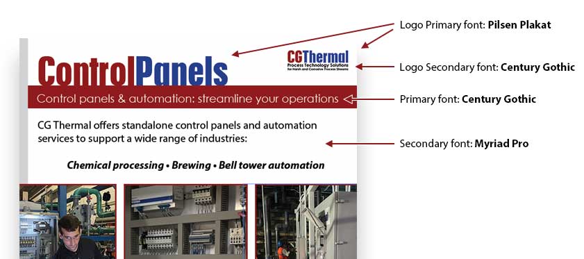
Logo Primary Font: Pilsen Plakat
Usage: Logo, Headings
Weights: Regular
Logo Secondary Font: Century Gothic
Usage: Body text, quotes
Weights: Bold
Primary Font: Century Gothic
Usage: Headings, Body text
Weights: Bold, Regular
Secondary Font: Myriad Pro
Usage: Body text, quotes
Weights: Bold, Regular, Italic
Brand Colors

- Primary Color: Red
- Hex: #901a1c
- RGB: (144, 26, 28)
- CMYK: (0, 82, 81, 44)
- Pantone: PMS 7628 C
- Usage: Red is the primary brand color, used for call-to-action buttons, headings, and any key focal points in design materials.

- Secondary Color: Blue
- Hex: #243e8e
- RGB: (36, 62, 142)
- CMYK: (74, 56, 0, 44)
- Pantone: PMS 7687 C
- Usage: Blue is used as a secondary color for backgrounds, subheadings, and elements that complement the primary red color.
Imagery and Photography Style
Our imagery should reflect our commitment to quality, professionalism, and precision.
Style: Use clean, high-quality images that emphasize clarity and detail. Our visuals should convey expertise and reliability, whether they showcase our products or the people behind them.
Preferred Photography: Focus on well-lit, natural images that feel genuine and authentic. Showcase our products in use, preferably in real-world settings or clean, technical environments.
Avoid: Avoid overly staged, unrealistic photos or images that are too busy or cluttered. We want our visuals to be straightforward, professional, and easy to engage with.
Example: The ideal image would focus on a technician working on equipment, highlighting the craftsmanship and quality of our products.


Tone and Voice
Our brand voice is clear, professional, and approachable.
Voice: We communicate with confidence and authority, without being too formal. Our tone is friendly but focused, ensuring we’re always providing valuable insights while remaining accessible to our audience.
Tone: Depending on the context, our tone can vary:
Formal: Used in official communications, proposals, and industry reports.
Friendly: Used in social media posts, customer support messages, and internal communications.
Engaging: When talking about new projects or solutions, we use an enthusiastic tone that conveys excitement without being overly casual.
Example Phrase: “We specialize in delivering solutions that enhance reliability and efficiency in every project.”
Basic Usage Examples
Here’s how to use our brand elements consistently:
Logo: Our logo should always have ample space around it to ensure visibility. It should never be stretched or altered. The primary version of the logo should be used unless specific guidelines are given for an alternative version (e.g., icon-only).
Example: Use the full logo on website headers and in official materials. The icon-only version can be used for social media avatars or when the space is limited.
Color Usage: Red is our primary color and should be used for calls to action, buttons, and key headings. Blue complements red and works well for secondary elements, backgrounds, and text.
Example: For a website, red should be used for the primary CTA button (e.g., “Contact Us”), while blue can be used for navigation links or secondary buttons.
Typography: Use our primary font for headings and bold statements, while our secondary font is for body text. The heading font should be large, bold, and used sparingly for impact. Body text should be easy to read and consistent in size across materials.
Example:
Heading: Bold, large (e.g., “Our Process”).
Body Text: Regular weight, standard size (e.g., “We deliver innovative solutions to complex challenges”).
Trademarked Words & Phrases
When used in printed articles, blog posts, web pages, or other published materials, the word Impervite® must include the registered trademark symbol (®) at first or most prominent use. The word Multiblox™ should include the trademark symbol (™) at first or most prominent use.
This includes instances where these terms precede descriptive phrases (e.g., Impervite® Graphite, Multiblox™ Panel Systems).
While the trademark symbol is not required after every mention within the same piece, it should appear at least once per article, webpage, or document — ideally with the first or most visible usage.
Examples of correct usage:
Impervite® Graphite shell and tube heat exchanger
Impervite® Advanced Graphite
Multiblox™ heat exchanger
Last Revised: August 2025
Questions About How to Use Our Brand Style?
If you have any questions or need clarification on how to use our brand guidelines and associated elements, we’re here to help. Whether it’s about logo placement, color usage, or how to ensure your designs align with our brand, please don’t hesitate to contact us.
We’re happy to guide you and ensure the consistency and quality of everything we create together!


